
Review: Vivaldi Browser for Windows

Publisher: Vivaldi Technologies
Available Platforms: Windows (7+,32 bit or 64 bit), MacOS (10.9+), Linux (DEB or RPM, 32 bit or 64 bit)
Price: Free to download from publisher
EE Critic Score: 8/10
There hasn’t been a big new desktop browser in some time, it seems like. There actually has been; Microsoft released Edge with Windows 10 about a year ago. But Edge was just a part of a whole new OS, and, at least at first, didn’t do much. (It still doesn’t even have a full screen mode). Overall, Edge didn’t make any great impression on browser nerds.
So, enter Vivaldi, a new web browser developed by Oslo-based Vivaldi Technologies, a company started by Opera co-founder Jon von Tetzchner. Vivaldi is built on Google’s Chromium, and can run extensions developed for the Chrome browser. But you might not need very many.

Vivaldi’s main draw is its bucking of trends that have been influencing browsers for some time now. Lately, browsers have been focusing on minimalism. The fairly bare-bones Edge is a good example of this, as was the Windows 8 “Metro-style” mode of Internet Explorer. Firefox, Chrome, and Safari have all been moving toward a more minimalistic user interface, endeavoring to “get out of the way” of web content. And why shouldn’t they? Minimalism has been the prevailing trend in digital interface design for a while, and with good reason. Screen area is finite, and the more on the screen at once, the harder it is to focus on whatever particular thing should be the focus of the viewer. Webpages have been steadily becoming emptier in pursuit of readability; those who haven’t adopted these design principles look weirdly messy today (specifically I’m thinking of discovermagazine.com and most sci-fi websites besides Tor). Browsers have followed suit, merging address and search boxes, removing task bars, bookmark bars, and various other menus, all to further focus on the page itself.
But, of course, there is a tradeoff. Every removed button, menu, and input box is a removed function. This doesn’t matter to most people; if it did, browser developers wouldn’t remove any functions. But there are still some people who valued extensive functionality in their browsers, and are finding fewer and fewer options to suit their tastes.
These are the people Vivaldi has claimed as friends, as in their tagline, “A browser for our friends”. Vivaldi has no delusions of becoming the next Chrome; their goal seems more to become the very best of a particular kind of browser: the power-use browser. I’ve been using Vivaldi as my primary browser for a few months now, trying to really understand it. Here’s a review:
Features & User Experience
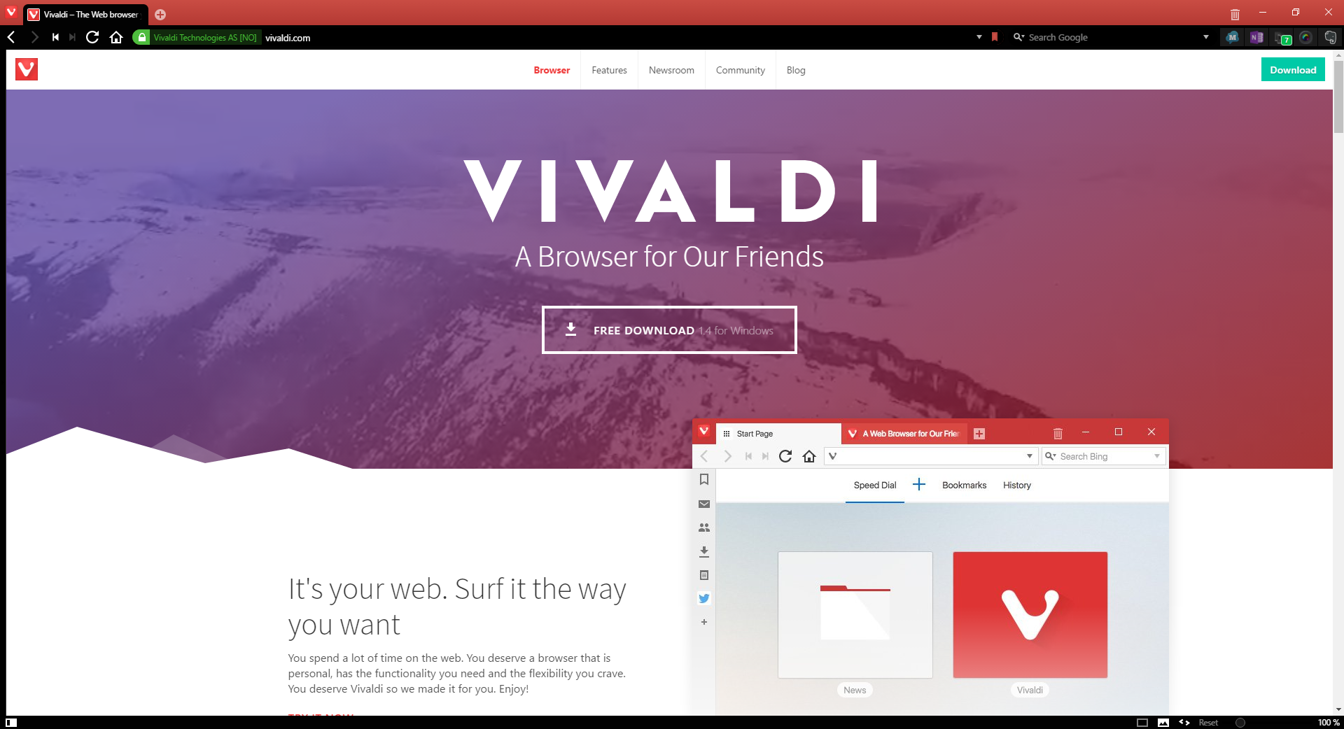
For all its feature-richness, Vivaldi maintains a fairly clean appearance, in its main configuration. As a default, the tabs, address and search bars, and menu button are on the top of the window, while page display options are at the bottom. The address bar/search bar can be set to the bottom of the window, and tabs can be set to the bottom or either side.
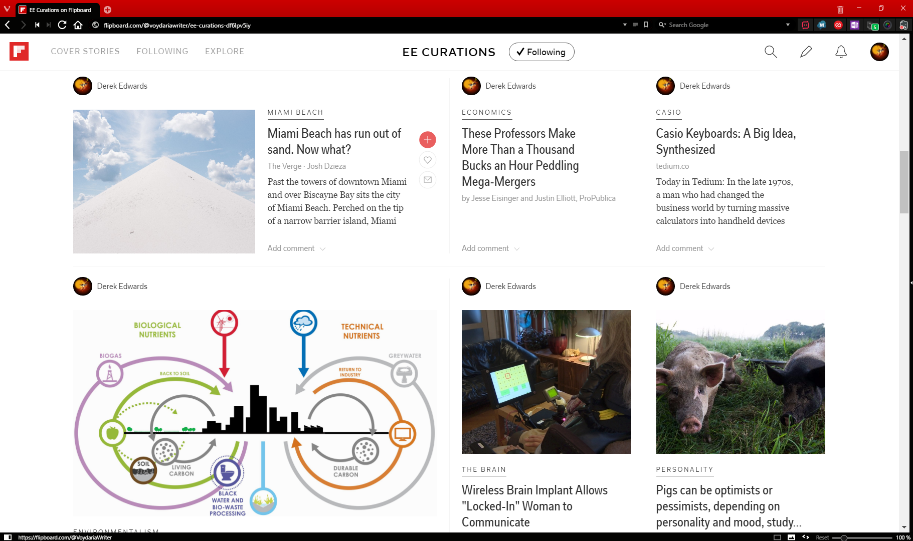
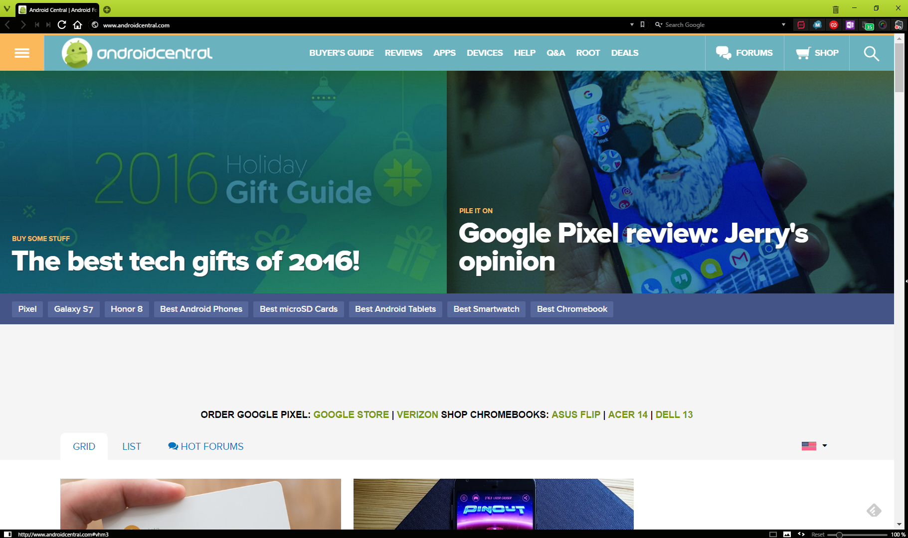
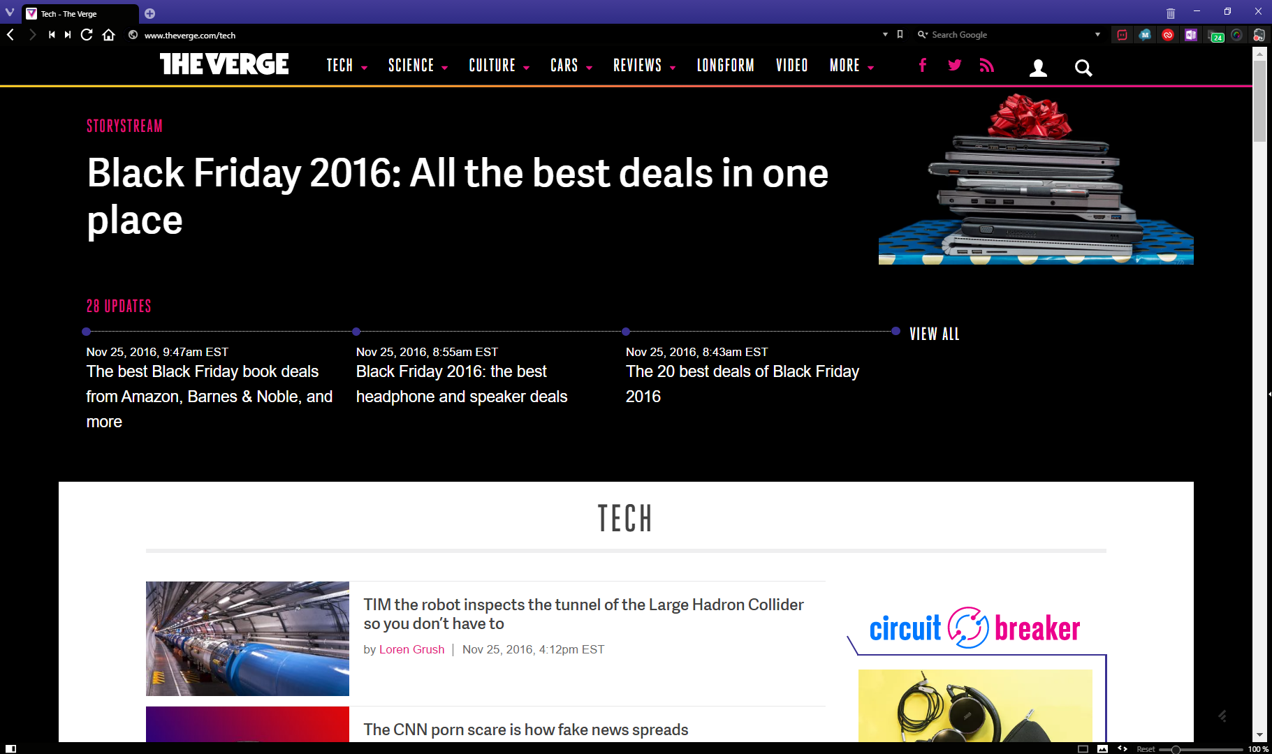
A distinctive feature is the color-changing tab bar. If you want, rather than a single, unchanging color, you can set the tab bar to change color to the main color of the website being displayed in that tab.
Web Navigation
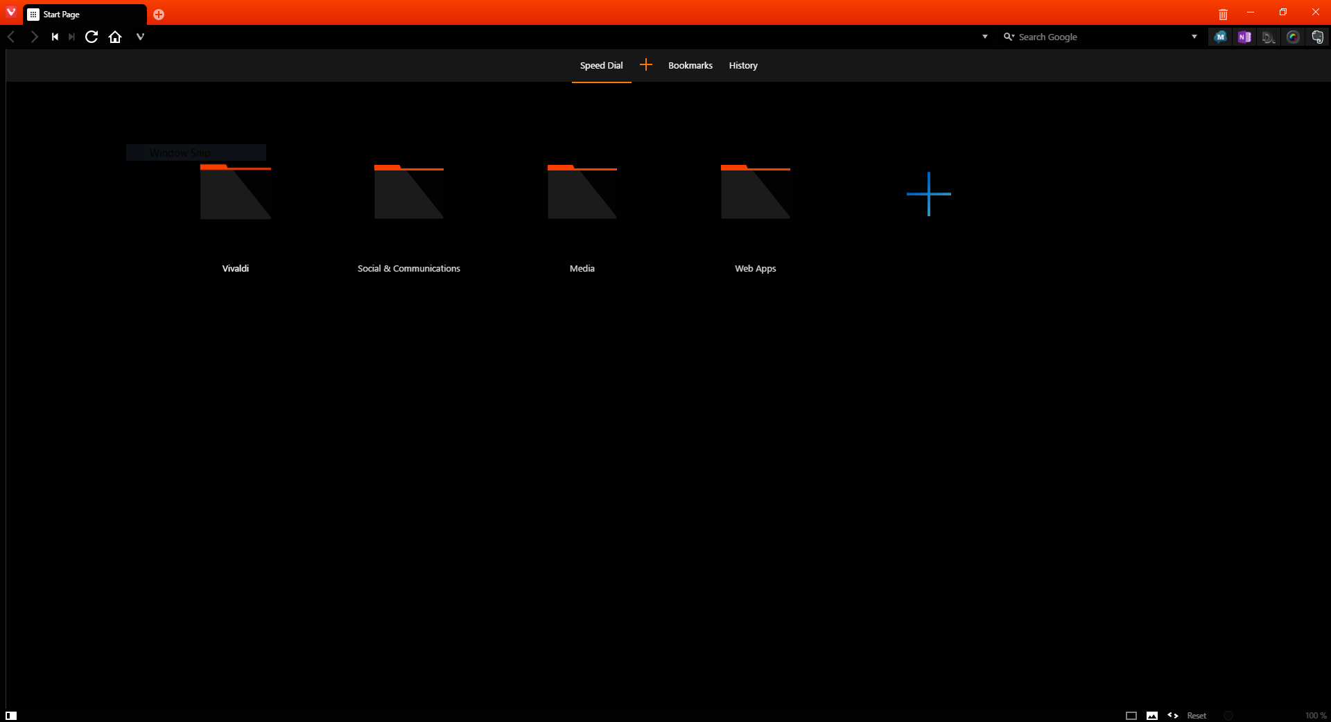
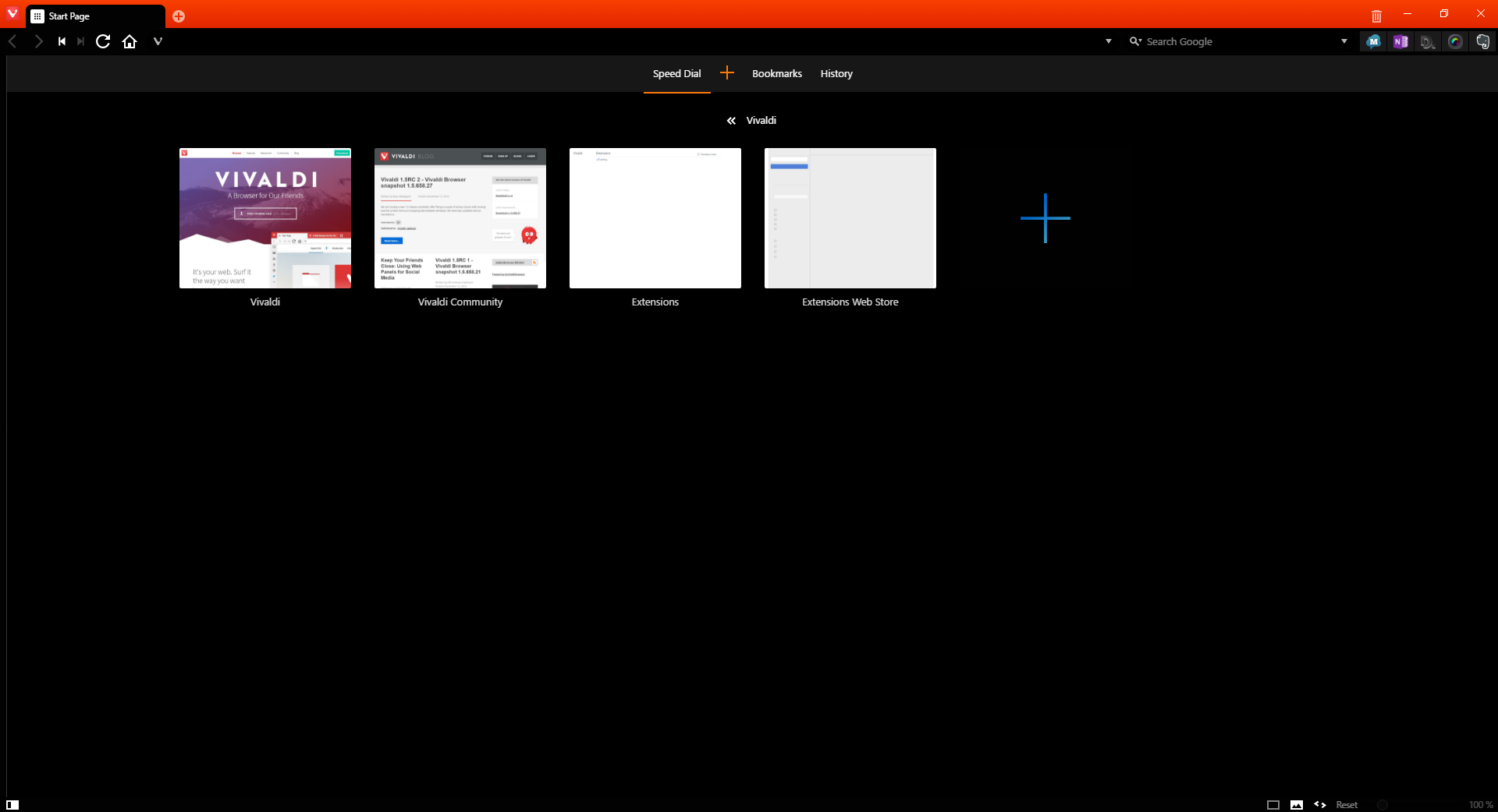
Vivaldi has a new tab page similar to that of Opera, even being called “Speed Dial”. The Speed Dial is part of a very robust bookmarks system, which allows for easy search through nested folders.
Firefox users will be happy to see that Vivaldi, too, still believes in a dedicated search bar. Like Firefox, the search bar will support multiple search engines. I’ve had some issues with certain search fields simply rerouting to the site homepage, though.
The address bar can also be used to search with the default search engine.
The Panel
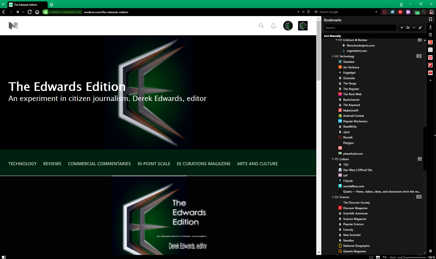
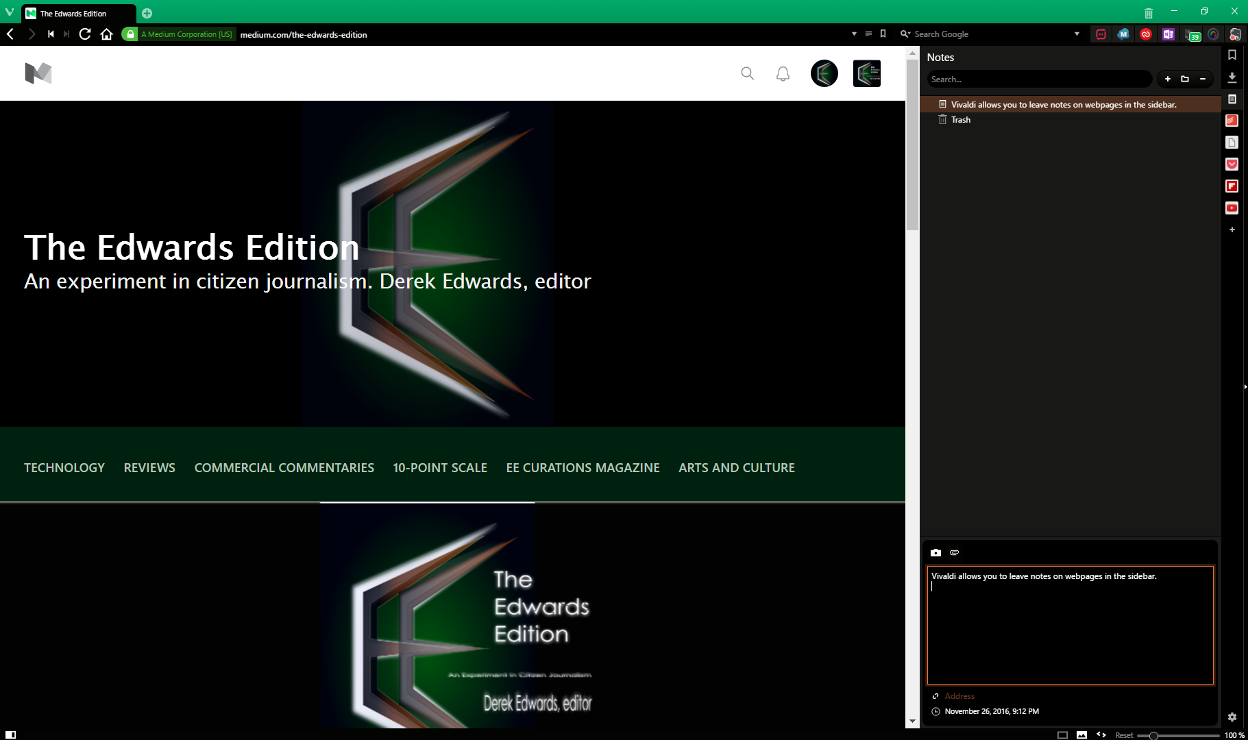
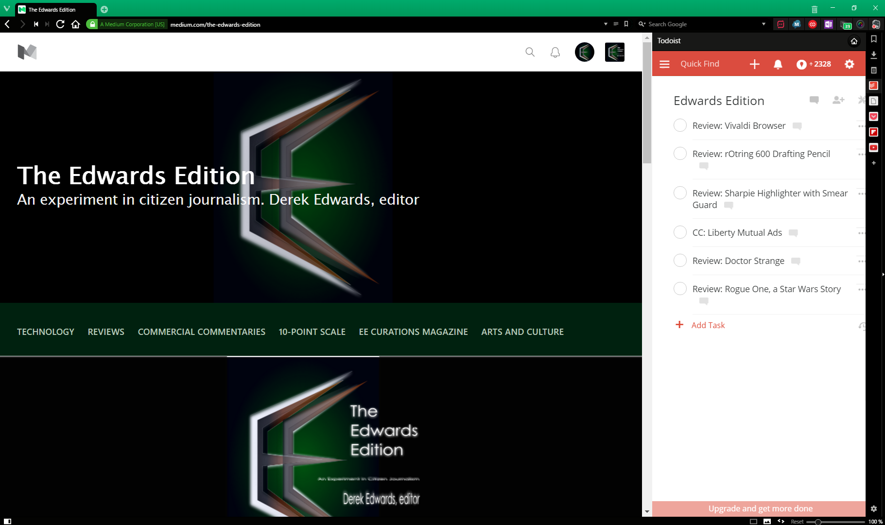
Possibly the most useful difference between Vivaldi and most other browsers is its “Panel” feature, a sidebar which displays, as default, bookmarks, downloads, and notes. In addition to this, the user can add “web panels”, which are panels which load the mobile site of a given web address. (The site in the web panel above is Todoist, my preferred task list, showing my current list of things to write here.) I could see how the panel could be a useful for browsing social feeds, as links to other sites opened from the panel open in a new tab in the main browser.
Tab Grouping
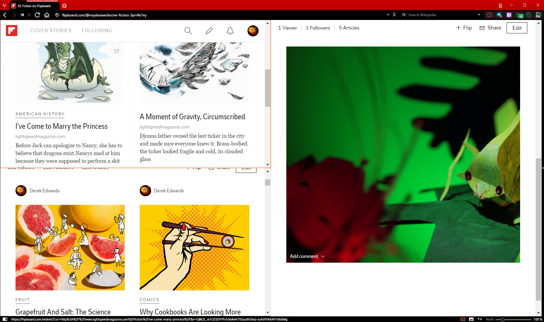
Vivaldi allows for tabs to be “stacked” into groups, which can be displayed either as normal or in some side-by-side configuration (either spread horizontally, spread vertically, or sorted into a grid). There doesn’t appear to be a limit to how many pages can be displayed this way, although for most screens the basic geometry of displaying a dozen pages side by side is pretty impractical.
Further Customization
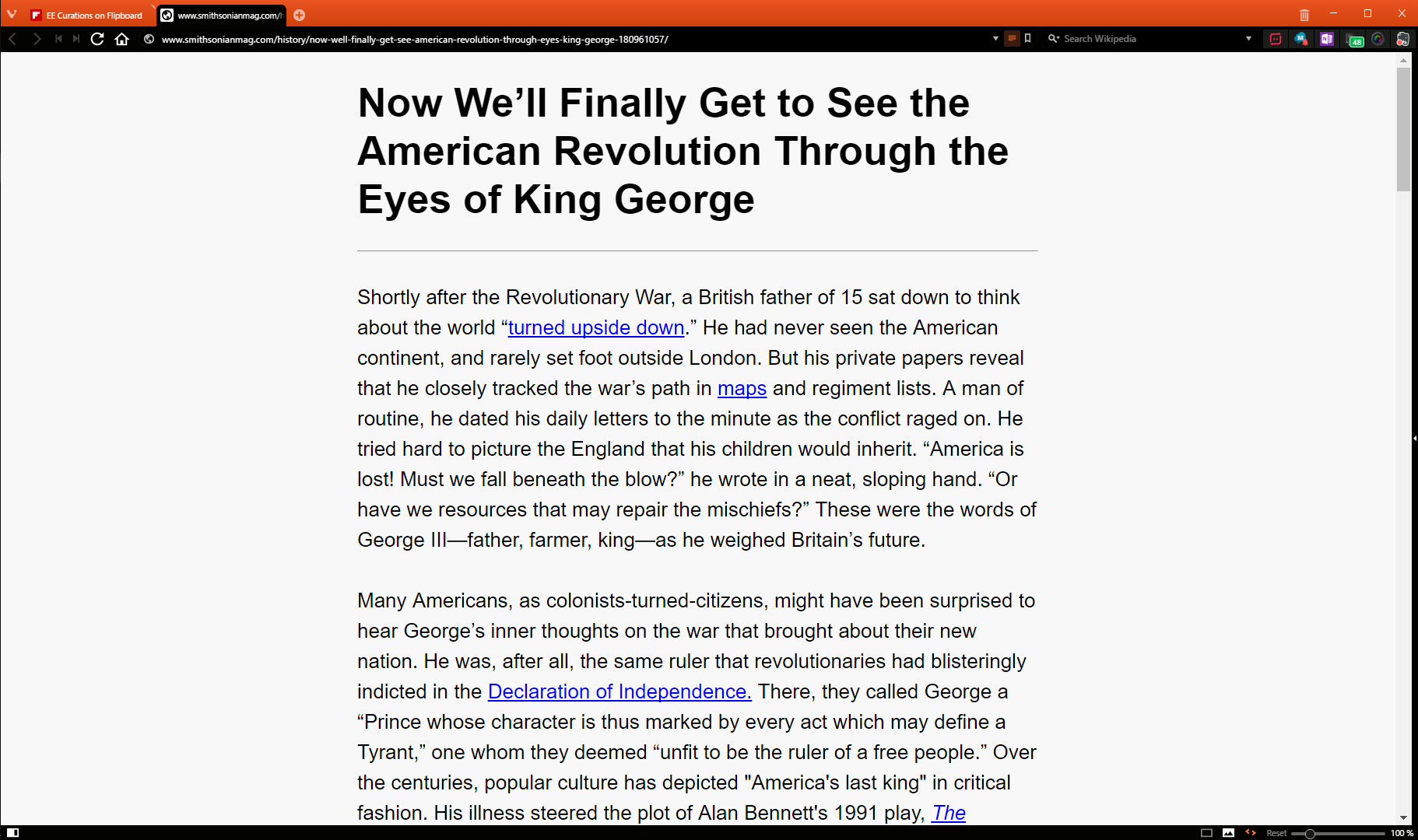
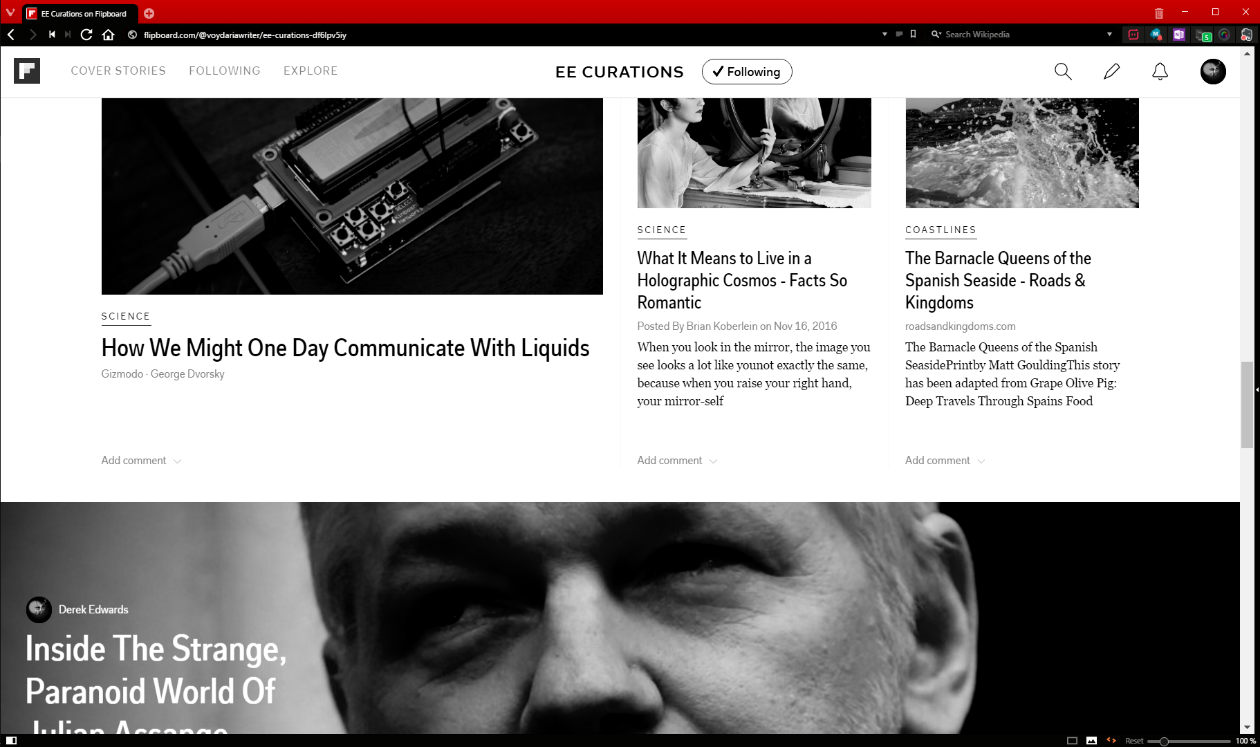
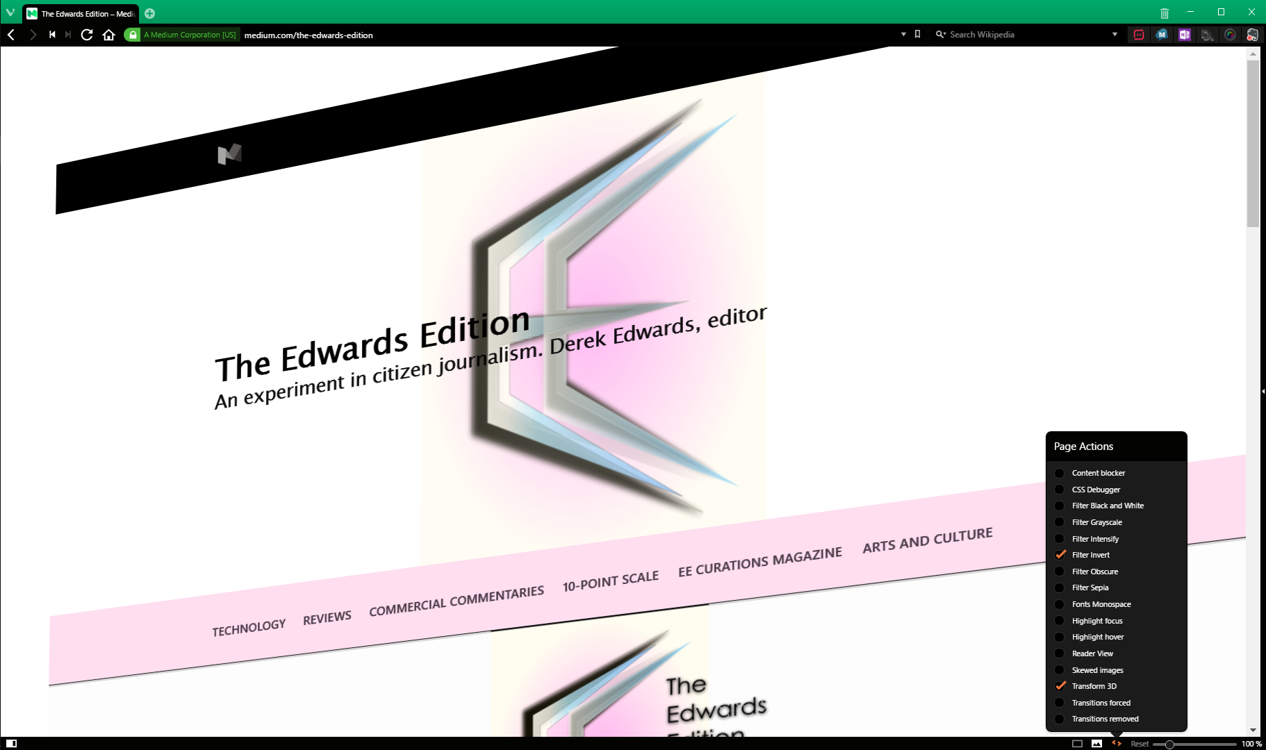
Vivaldi has several additional ways of displaying webpages. It has a Reader mode, which extracts the text of an article to allow for a more comfortable reading experience. (This isn’t unique to Vivaldi: every major desktop browser but the biggest, Chrome, has this built in) It also allows for you to toggle the display of images, to put filters (greyscale, black & white, greater intensity, blur, sepia, and more) on a webpage, to set fonts to monospace, or skew images, or do any number of things of various practicality.
Like many desktop applications, Vivaldi has keyboard shortcuts. These are fully re-mappable within Vivaldi’s settings. The same goes for mouse gesture shortcuts.
Lastly, Vivaldi, as a Chromium-based application, is compatible with most Chrome extensions.
What I Like
Vivaldi’s customizability is pretty much unparalleled. For a good while now Firefox has been the choice for browser geeks but I could genuinely see that changing if Vivaldi can pick up some momentum. It does have some of Chrome’s drawbacks (I’ll get to those in my “What I Dislike” section) but it has most of Firefox’s distinctive features, plus some more.
The panel has turned out to be a lot more useful than I thought it might. I’ve found the Bookmarks panel more effective than the traditional bookmarks bar. Web panels have also been handy for things like web apps or search engines. One tap (of the F4 key by default, which is how I’ve left it) toggles the panel, which makes it considerably more easy to use than Firefox’s sidebar.
The fact that chrome extensions will run on Vivaldi is great, considering that Firefox has a weird lack of extensions made by web service providers for their own services, and Edge has **goes to count because one can actually do that because there are only** nineteen total extensions published for it so far, five of which are made by Microsoft themselves. Chrome is the dominant ecosystem for browser extension developers, so it’s good to be able to tap into that.
Vivaldi does a really good job of offering the user options without crowding the window with menus. Its UI can be rescaled in the settings. I have it set to 75% scale, which makes the various things in the periphery of the window smaller than in Edge or Firefox, and roughly the same scale as in Chrome, while still being entirely readable. Of course, this might not work for you if your eyes are worse than mine, but, then again, you can adjust the scale of the UI (and the default webpage scale, as well) to suit your needs.
And that’s really what I like about this browser. If there’s something I don’t like, I can change it. That’s something increasingly difficult to do with other browsers.
What I Dislike
As I mentioned, Vivaldi is based on Chromium, which means that, like Chrome, it is a fairly resource-intensive browser. I’ve had no performance issues; it doesn’t make anything run noticeably slower or hotter, but if you have an older, less powerful machine, this might be an issue for you.
I also mentioned that Vivaldi runs Chrome extensions. So, you might ask, does it run Chrome apps? Well — sort of. You can install Chrome apps, but they might not run, and it’s more difficult to launch them from Vivaldi than from Chrome proper.
In any event, by around this time next year, Chrome will be shuttering Chrome apps on anything but Chromebooks anyway. (And with Android apps being integrated into Chrome OS, maybe they’ll be going away there too, but that’s just my own speculation) So, even if you’re one of the apparently few people who use Chrome apps, Vivaldi’s not effectively running them won’t be a downside for much longer.

Besides all this, Vivaldi tends to prefer opening new tabs rather than fly-out windows. This gets annoying, but it’s a minor thing.
How I Use It
I use Vivaldi as my everyday browser. It’s a really good browser; it does everything I need of a browser. I’m not sure what else to say. Although, there is one thing it can’t do…
Yeah, you know how I’ve been taking potshots at Microsoft Edge off and on through this review? I’ve actually been using it this whole time.
Medium drafting doesn’t work in Vivaldi. I was going to throw this bit of information in under “What I don’t like”, but I decided not to because it’s almost certainly not Vivaldi’s fault. Medium has weird under-the-hood things where it doesn’t work on all browsers. (It didn’t even work on Edge when Edge first came out). Vivaldi can read Medium, but it can’t write it. Yet. Maybe it never will. Vivaldi’s not a big-name browser, and the Vivaldi user/Medium writer demographic overlap might be just me.
But for everything but Medium writing, I recommend Vivaldi. I thought it might be a pretty niche browser for geeky power users when I first started using it; that’s how Vivaldi billed themselves, even. But that’s not really true. I can’t think of a reason why a regular browser user wouldn’t feel able to use Vivaldi.
8/10 — Without significant negative worth. Able to be recommended, at full price, without reservation

The Edwards Edition was not contacted by, nor did the Edwards Edition contact, Vivaldi Technologies. The Edwards Edition was not provided a discount on this product, nor did Vivaldi Technologies give any reimbursement to the reviewer. All opinions are given of the pure volition of the reviewer and of the Edwards Edition, without persuasion or compensation by either Vivaldi Technologies or some other entity.


Member Commentary